
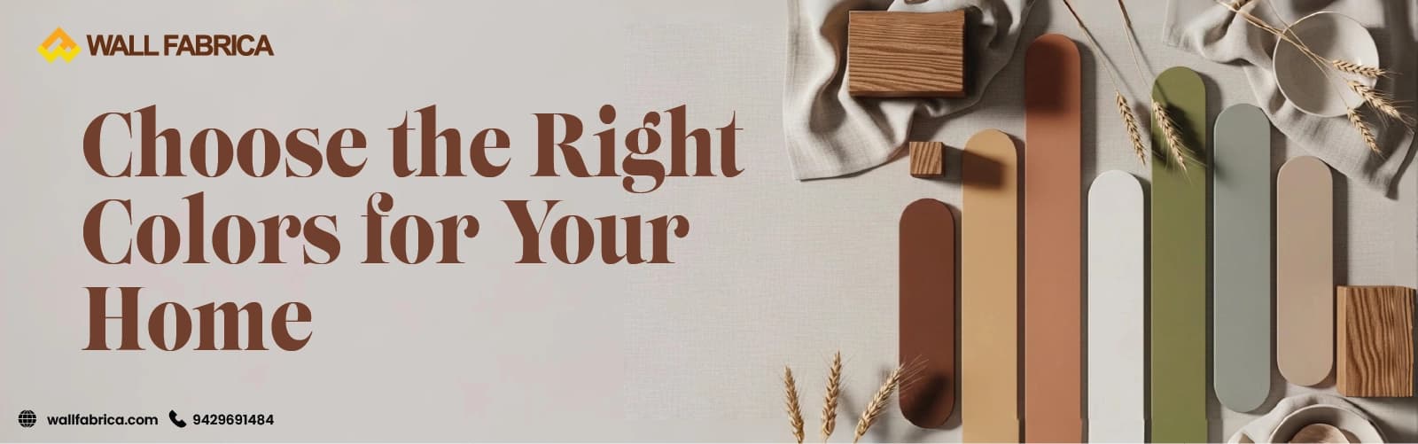
A client once told me she couldn't figure out why her bedroom always felt "heavy," even though she loved the deep charcoal she'd painted it. We repainted it in a soft, warm neutral, and within a week she messaged to say the room finally felt like somewhere she wanted to fall asleep. Nothing else in the room changed. Just the colour.
That's really the whole point of colour psychology — it's not decoration theory, it's something you feel every single day without necessarily knowing why. Here's how I actually think about it when I'm planning a home, room by room.

People sometimes tell me white feels like the "safe, unimaginative" choice. It isn't. It's doing something specific.
If you're working with a smaller flat in Ranchi or Bokaro, this is usually where I start.
There's nothing flashy about beige or cream, and that's precisely their job.
If a room's job is rest or focus, blue is one of the few colours that actually supports that job rather than just decorating it.
Not every home in Ranchi or Bokaro has a garden view, but green still manages to borrow that calm.
Grey has become the default "modern" choice, and there's a reason for that — but it comes with a catch.
Yellow is one of the fastest colours to change how a room feels, but it's also the easiest to get wrong.
Every home needs at least one colour that feels grounded rather than decorative, and brown does that job well.
Soft pinks and pastels have a genuinely calming effect — they're the colour equivalent of lowering your voice.
| Room | Colours That Work Best |
|---|---|
| Living room | Beige, cream, light grey |
| Bedroom | Soft blue, pastel, beige |
| Kitchen | White, light yellow |
| Study | Blue, green |
| Kids' room | Pastel shades |
| Entry area | White, wood tones |
It's genuinely true — lighter, more reflective shades bounce light around the room and make walls appear to recede, which makes a small space feel noticeably more open.
Beige or cream. Warm enough to feel inviting, neutral enough that you won't tire of it or need to redo it in a year.
Neither in isolation — they work best chosen together. The paint sets the room's base mood, and the panelling adds the texture and focal point on top of that mood.
Colour is the quietest decision you'll make in a home, and also the one you live with every single day. Choose it based on how you actually want each room to feel, not just what looks good in a photo — and let it work together with your lighting and panelling instead of competing against them.
If you're thinking about how colour, ceiling design, and panelling come together in one space, our guide on false ceiling and wall panel combination ideas walks through exactly that pairing. And if you're planning this for a home in Bangalore, Ranchi, or Bokaro, this is the kind of colour-first thinking Wallfabrica builds into every project from the very first conversation.