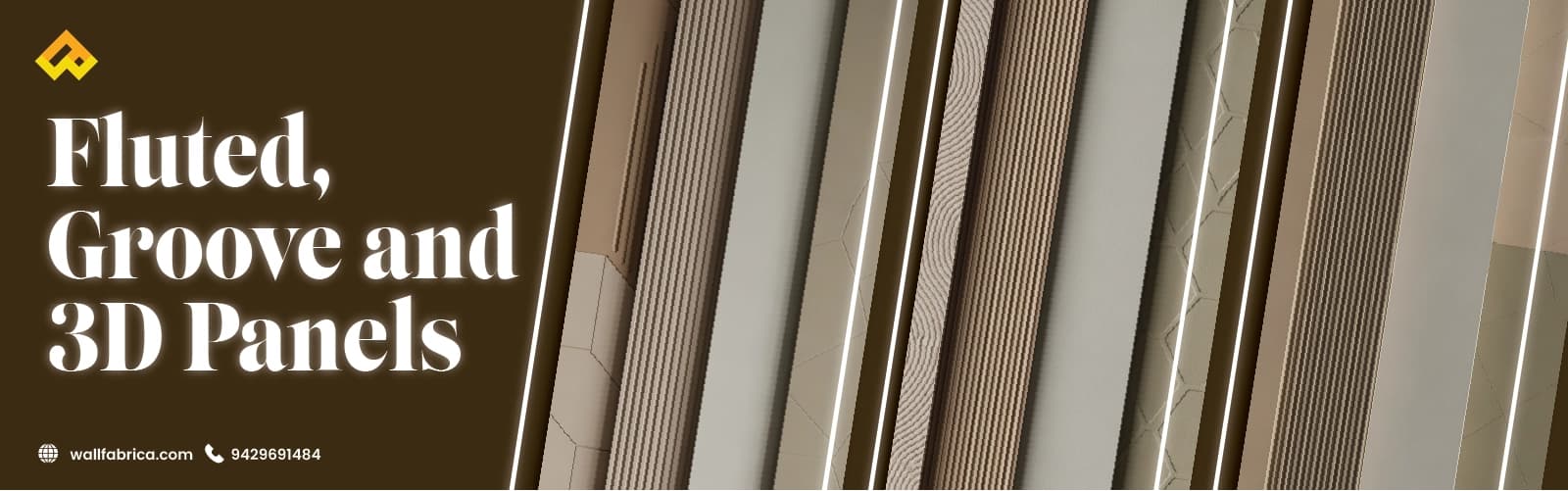
A few years ago, almost every client wanted a "feature wall" that meant one bold paint colour. Now, the request has shifted — people want texture, not just colour. Fluted, groove, and 3D panels have become the go-to way to give a wall shape and depth without touching the layout or the budget for major civil work. Here's how I'd guide you through picking the right one.

Fluted panels are exactly what they sound like — evenly spaced vertical grooves running down the wall. Simple idea, strong effect.
There's a reason architects and designers keep returning to this pattern instead of moving on to the next trend.
One practical note I always share with clients: dust does settle into the grooves over time, so a fluted profile with shallower channels and a smooth, wipeable finish is easier to maintain long-term (Studio Matrx).
If fluted panels are the confident statement, groove panels are the quiet, understated cousin.
I steer clients toward groove panels specifically when the room itself needs to stay quiet.
3D panels are the one pattern designed purely to grab attention — and that's exactly their job.
This is the part homeowners underestimate the most: without the right light, a 3D panel just looks like a slightly bumpy wall.
| Pattern Type | Best Use |
|---|---|
| Fluted | Modern living rooms, TV walls |
| Groove | Bedrooms, study areas |
| 3D | Feature walls, statement areas |
| Vertical patterns | Small rooms |
| Bold patterns | Larger rooms |
It's a genuine effect — vertical grooves visually lift the eye upward, which noticeably helps rooms with standard Indian ceiling heights feel less boxed-in.
Groove panels, generally. Their shallow cuts collect less dust than deeper fluted channels, and the understated look doesn't date as quickly.
It's best to stick to one pattern per space. Mixing fluted, groove, and 3D in one room tends to compete rather than complement.
Every pattern says something different — fluted brings structure, groove brings calm, 3D brings focus. Pick one per space, let your lighting support it, and resist the urge to combine all three just because you like all of them.
If you're also thinking about how colour ties into this choice, our guide on interior colour psychology for homes is worth reading alongside this one — colour and texture work best when planned together, not separately. And if you're planning this for a home in Bangalore, Ranchi, or Bokaro, this is exactly the kind of pattern-and-lighting planning Wallfabrica brings into every project from the start.